Page 1 of 8 12345 ... LastLast
Results 1 to 25 of 187

Thread: Best Band Logos

  1. #1
    Oh No! Bass Solo! klothos's Avatar
    Join Date
    Jul 2013
    Location
    Here
    Posts
    308

    Best Band Logos

    Still my favorite:


    Industrial band Einstürzende Neubauten was brilliant with their logo: it was simple and catchy, and a fan could easily draw a sophomore-ish version --- for people that like industrial music during its hey day in the 90s, they knew the band just from the logo even if they couldnt pronounce the name


    I also like ELO's first logo which was a spin on the GE logo


  2. #2
    Member rcarlberg's Avatar
    Join Date
    Nov 2012
    Location
    Seattle
    Posts
    7,765
    Roger Dean is responsible for Yes (or, YES) and Osibisa. Do stylized names count as logos?

  3. #3
    Oh No! Bass Solo! klothos's Avatar
    Join Date
    Jul 2013
    Location
    Here
    Posts
    308
    Quote Originally Posted by rcarlberg View Post
    Roger Dean is responsible for Yes (or, YES) and Osibisa. Do stylized names count as logos?
    absolutely

  4. #4
    Member lak611's Avatar
    Join Date
    Jun 2016
    Location
    Cleveland, OH
    Posts
    616
    I like the Rush starman.


    Sent from my XT1575 using Tapatalk
    Laura

  5. #5

  6. #6
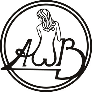
    Yes' is the most iconic of the prog ones, to me. Certainly, The Beatles' logo is as iconic as it gets; although it's not a great design. There are some really great ones, but also many more missed opportunities from a graphic design perspective, IMO. The AWB one in the OP is a missed opportunity.
    "The White Zone is for loading and unloading only. If you got to load or unload go to the White Zone!"

  7. #7
    Oh No! Bass Solo! klothos's Avatar
    Join Date
    Jul 2013
    Location
    Here
    Posts
    308
    Quote Originally Posted by ronmac View Post
    Yes' is the most iconic of the prog ones, to me. Certainly, The Beatles' logo is as iconic as it gets; although it's not a great design. There are some really great ones, but also many more missed opportunities from a graphic design perspective, IMO. The AWB one in the OP is a missed opportunity.
    things were different back then and function had to be balanced with form: the AWB logo back then may have been designed the way it was for silk screening purposes for single color T Shirts or easy steniciling, such wouldnt be thecase today where more finer attributes or lines in the logo or in detail could be appended so "adding to" ( I mean, the "B" could be made into boobs )

  8. #8
    Parrots Ripped My Flesh Dave (in MA)'s Avatar
    Join Date
    Nov 2012
    Location
    42°09′30″N 71°08′43″W
    Posts
    6,315

  9. #9
    Member -=RTFR666=-'s Avatar
    Join Date
    Nov 2012
    Location
    Phoenix AZ USA
    Posts
    763
    ....aaaaand Cap'n Obvious submits for your consideration...

    ELP.jpg
    -=Will you stand by me against the cold night, or are you afraid of the ice?=-

  10. #10

  11. #11
    Moderator Poisoned Youth's Avatar
    Join Date
    Feb 2002
    Location
    Nothern Virginia, USA
    Posts
    3,030


    WANTED: Sig-worthy quote.

  12. #12
    The Yes "bubble" logo is a favorite. So is the Thin Lizzy. The Van Der Graaf Generator logo, the one on the covers of Godbluff, Still Life, and World Record, is also great.

    The Who had a couple cool logos, the one with the two H's linked together (and the "male" symbol in place of the O) and the one with "THE" going vertically and "WHO" going horizontally.

    The Kiss logo is notable, if only because it led to the band being accused of being Nazis.

  13. #13
    Moderator Poisoned Youth's Avatar
    Join Date
    Feb 2002
    Location
    Nothern Virginia, USA
    Posts
    3,030
    WANTED: Sig-worthy quote.

  14. #14
    Parrots Ripped My Flesh Dave (in MA)'s Avatar
    Join Date
    Nov 2012
    Location
    42°09′30″N 71°08′43″W
    Posts
    6,315
    compoop.jpg

    I always thought it would be funny to get some of these printed up as bumper stickers.

  15. #15
    I nominate Magma's.

  16. #16
    Quote Originally Posted by Poisoned Youth View Post
    A bit like Kayak

  17. #17
    Member Zeuhlmate's Avatar
    Join Date
    Nov 2012
    Location
    Copenhagen, Denmark
    Posts
    7,326
    Quote Originally Posted by Facelift View Post
    I nominate Magma's.


  18. #18
    Quote Originally Posted by klothos View Post
    things were different back then and function had to be balanced with form: the AWB logo back then may have been designed the way it was for silk screening purposes for single color T Shirts or easy steniciling, such wouldnt be thecase today where more finer attributes or lines in the logo or in detail could be appended so "adding to" ( I mean, the "B" could be made into boobs )
    I disagree. Simplicity applies to logos all the time. It always had and always will. A good logo still needs to be reproducible in one color. It's an amateurish design and execution. If it was reduced to a tiny size, it would be unreadable.
    "The White Zone is for loading and unloading only. If you got to load or unload go to the White Zone!"

  19. #19
    I always thought the Angel logo was pretty cool, because it was the same upside-down.


    The band sucked, though.
    "The White Zone is for loading and unloading only. If you got to load or unload go to the White Zone!"

  20. #20
    Moderator Poisoned Youth's Avatar
    Join Date
    Feb 2002
    Location
    Nothern Virginia, USA
    Posts
    3,030
    Quote Originally Posted by ronmac View Post
    I disagree. Simplicity applies to logos all the time. It always had and always will.
    I like Muse's for that reason...
    WANTED: Sig-worthy quote.

  21. #21
    facetious maximus Yves's Avatar
    Join Date
    Nov 2012
    Posts
    1,621
    "Corn Flakes pissed in. You ranted. Mission accomplished. Thread closed."

    -Cozy 3:16-

  22. #22
    Member viukkis's Avatar
    Join Date
    Nov 2012
    Location
    Espoo, Finland
    Posts
    163
    Quote Originally Posted by ronmac View Post
    I always thought the Angel logo was pretty cool, because it was the same upside-down.
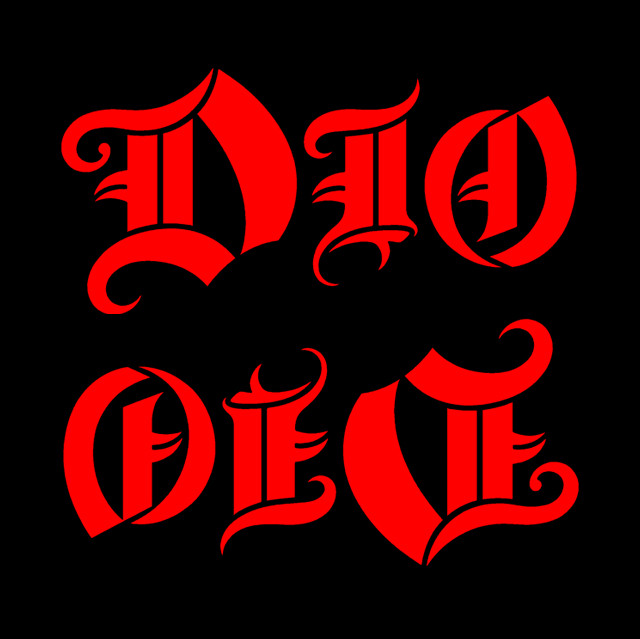
    However, if you turn the Dio logo upside down, it kind of looks like "devil". Which would be quite impressive if it was intentional, but it probably wasn't. Just like Judas Priest probably didn't intend Exciter to sound like "I asked for a peppermint, I asked for her to get one" when played backwards.


  23. #23
    Member Zeuhlmate's Avatar
    Join Date
    Nov 2012
    Location
    Copenhagen, Denmark
    Posts
    7,326
    Quote Originally Posted by Yves View Post

  24. #24
    Oh No! Bass Solo! klothos's Avatar
    Join Date
    Jul 2013
    Location
    Here
    Posts
    308
    Quote Originally Posted by ronmac View Post
    I disagree. Simplicity applies to logos all the time. It always had and always will. A good logo still needs to be reproducible in one color. It's an amateurish design and execution. If it was reduced to a tiny size, it would be unreadable.
    somebody needs to tell that to death metal bands...... I understand what you mean by amateurish execution, but amateurish design? i thought it was clever

  25. #25
    Member Jerjo's Avatar
    Join Date
    Nov 2012
    Location
    small town in ND
    Posts
    6,460
    I don't like country music, but I don't mean to denigrate those who do. And for the people who like country music, denigrate means 'put down.'- Bob Newhart

Bookmarks

Posting Permissions

  • You may not post new threads
  • You may not post replies
  • You may not post attachments
  • You may not edit your posts
  •