Time Honoured Ghosts from Barclay James Harvest


Time Honoured Ghosts from Barclay James Harvest


Well that's pretty fab, I never caught that either!Originally Posted by Trane

For some reason I like this cover, simple but to the points.

NEVER UNDERESTIMATE THE POWER OF STUPID PEOPLE IN LARGE GROUPS!

^That's worth some, er, coins.

Glad I could be of help.
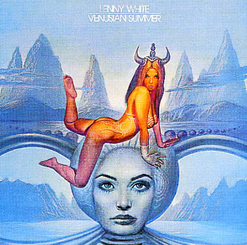
For some reasons, I caught that right away, first from the sticker with the two hands shaking: the four parts in the background are the four elements as well.
my music collection increased tenfolds when I switched from drug-addicts to complete nutcases.
re: Wish You Were Here:
Yes it is, it was taken at the Warner Bros studio in LA, if I remember correctly. But the fact that these guys get paid to do that kind of stuff all the time doesn't diminish the actual feat. Apparently, they took one stab at it, because the wind had made it too dangerous to do a second take, as it were, and as I said, from the time they set the guy's clothes on fire, until they hit him with the fire extinguisher was something like 20 or 30 seconds. That's ALL!
In that Wish You Were Here documentary, I can't remember which member of Pink Floyd it is, but one of them sort of accuses Storm Thorgerson and Aubrey Powell of using the photo shoot reccies as an excuse for a holiday, which they'd then bill to the band. "Oh, you know I had to spend two weeks scouring California to find just the perfect lake for the splashless diver shot!".they probably took more care and thoughts in the artwork of the cover than about the contents of the disc inside the sleeve.
Anohter interesting fact about Wish You Were Here's packaging, that most people forget, is that it was originally wrapped in black cellophane. Apparently, this was inspired by Storm Thorgerson seeing copies of whichever Roxy Music album it was, Country Life, I think, wrapped in green cellophane, to hide the "scandalous" cover, in US record stores. Supposedly, the executives at their record company were really bewildered when they were presented with this great package, and then told it would be hidden by the cellophane, until the record buyer got it home and removed the plastic wrap.


^ Hmm, my memory must be failing me. I remember WYWH packaged in dark blue cellophane.

I think it was black in the UK, dark blue in the U.S. I still have the (somewhat torn) blue shrinkwrap on my copy.
Hurtleturtled Out of Heaven - an electronic music composition, on CD and vinyl
https://michaelpdawson.bandcamp.com
http://www.waysidemusic.com/Music-Pr...MCD-spc-7.aspx

Rainbow - Rising
King Crimson - ITCOTCK
JG
"MARKLAR!"
I found that used in a record store for $5. I don't think I ever played it.
NEVER UNDERESTIMATE THE POWER OF STUPID PEOPLE IN LARGE GROUPS!
Uh, that (mine) remark was not axed towards WYWH, but Permanent Lapse of Sanity.
Floyd took extreme care of the music in WYWH, whereas, Gilmour +/- winged the crap on tape in the AMLOR , just to prove his ownership on the Floyd moniker. He later tacked on Mason and then Wright to give it legitimacy. The Lapse artwork is actually depressing (well the gloomy skies help too), and one of Storm's lesser ideas for Floyd - he's done worse before (with the UFO artworks & Tormato) and since (the Mars Volta and Audioslave artworks).
As for the "splasless dive", it's just a guy doing a handstand or headstand with his head and shoulders in the waters... No matter how well paid the stuntman is, I wouldn't be diving that way in such shallow waters
My copy is from Canada, and it had a transparent and loose shrinkwrap. I bought the album upon release and still own it... Also came with a postcard with the "diving in a lagoon" picture.
my music collection increased tenfolds when I switched from drug-addicts to complete nutcases.

Yessongs.
Gnish-gnosh borble wiff, shlauuffin oople tirk.

I'm pretty sure you are correct about the blue cello, in fact I still have mine...
OTOMH
:format(jpeg):mode_rgb():quality(90)/discogs-images/R-1025525-1433148063-6159.jpeg.jpg)

When I was younger I liked the fantasy prog covers but nowadays I favour the more simpler or abstract designs.
One of my favorite covers of recent years is Mirtkon - Snacks.
A great Andy Warhol inspired cover but in the booklet all songs had their own 'snack' with nutticional fact and ingredients. Very well done and original.
Cover:
https://images.app.goo.gl/i7qMnuXzev5kxA1n9
Examples booklet:
https://images.app.goo.gl/NmhXf72iF3oL9EBY6
https://images.app.goo.gl/dnF5oh3efGVRpe2q6

Not really abstract, but something different.
I like the nutrician facts.
Beatles Double White

my avatar... Mingo Lewis - Flight Never Ending
MINGO HQ copy.jpg
Why is it whenever someone mentions an artist that was clearly progressive (yet not the Symph weenie definition of Prog) do certain people feel compelled to snort "thats not Prog" like a whiny 5th grader?

The most entertaining cover of all time (the satiric newspaper even had a bawdy connect-the-dots game)...
Thick as a Brick 1.jpg
Thick as a Brick 2.jpg
And one of the most creative designs (an old school wooden desk that opened to reveal contraband)....
School's Out 1.jpg
alice-cooper-schools-out-3.jpg
The record sleeve was a pair of panties (which was unfortunately confiscated from me by a 7th grade teacher).
"And your little sister's immaculate virginity wings away on the bony shoulders of a young horse named George who stole surreptitiously into her geography revision."
Occasional musical musings on https://darkelffile.blogspot.com/

R-1988923-1420621204-7296.jpeg.jpg
Thought the drawing on the outside was a good brain warper...didn't get a similar buzz from listening to what was on the inside.
Those were some of Svetonio's choices. That goof couldn't pick 'em.

acidcas-lg.jpg
 Posting Permissions

 Reply With Quote


Bookmarks